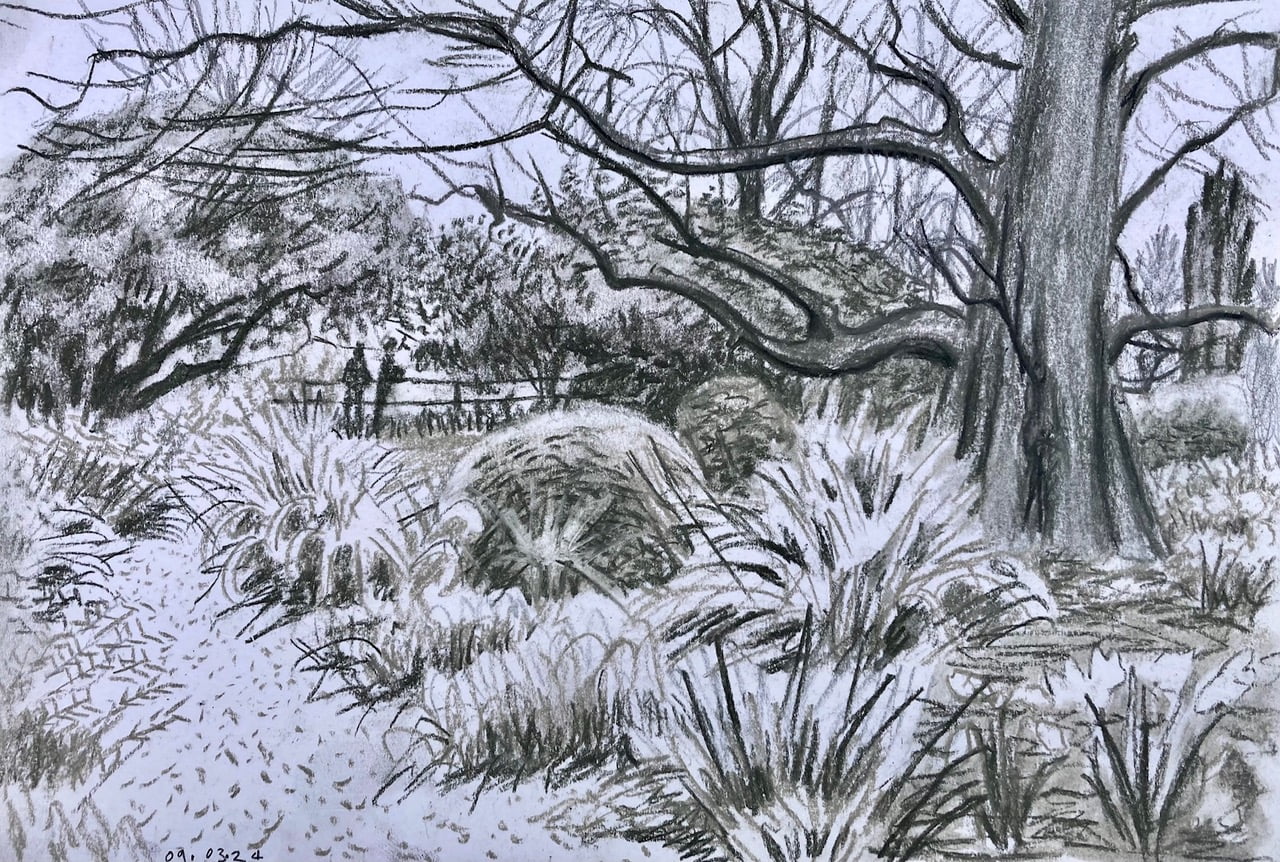
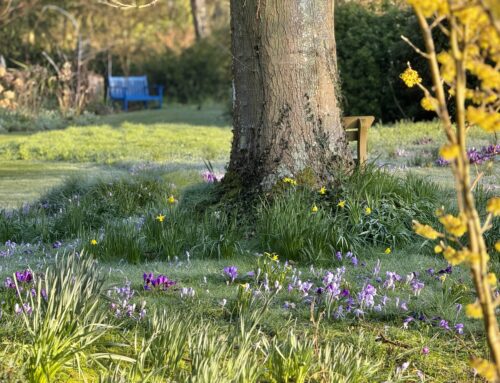
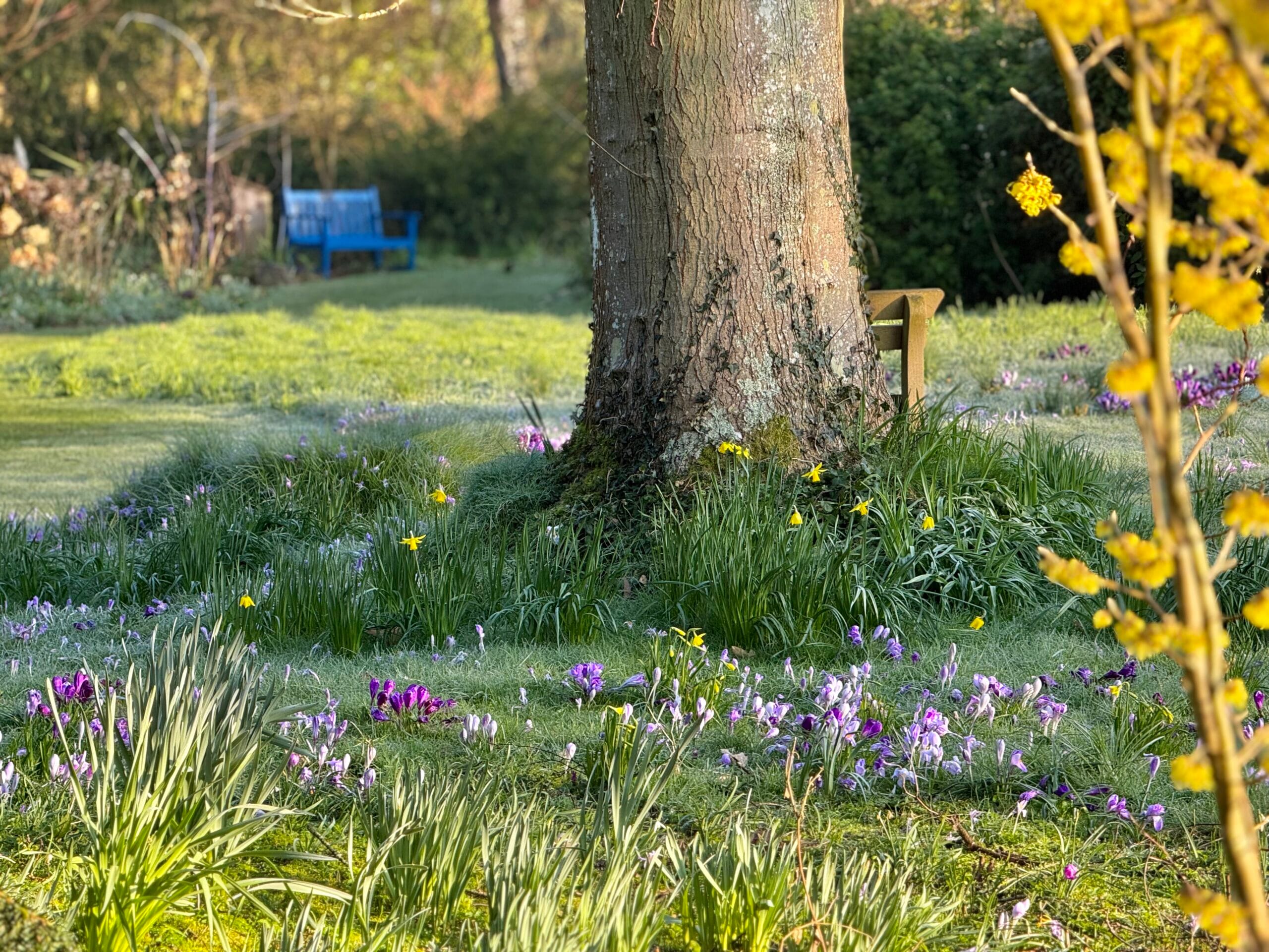
^‘Bare Winter Branches Form An Arch Across The Sky’
Over The Path On The 9th Of March’
Drawn live on location at Denmans Gardens.
Charcoal on Cartridge. 21cm x 14cm
The start of Summer coincides with the mid-way point in artist Oscar Romp’s residency with us at Denmans. Here he reflects on the garden as the seasons change with ruminations on the liberation of the summer season for painting outside, the beauty and nuance of working in black and white and capturing visitors to the garden in his work.
He also gives a vivid insight into producing a special piece of work – an interpretation of Clock House Garden which forms part of Denmans Garden’s exhibit feature garden ‘Room Outside’ at Hampton Court Palace Garden Festival:
Journal Entry 1: Arch against the Sky (09/03/2024) Paradoxically, the ubiquitous availability of unlimited filtered HD technicolour imaging seems to have blinded us to the qualities of ‘Black and White’, or monochrome imaging, where the emphasis is on a delight of full tonal range from light to dark, plus patterns and rhythms in the picture-scape. For me, the tonal range is a whole complex alphabet ranging from ‘black’ through gradations of grey through to ‘white’. The tonal artist feels that there’s really no such thing as ‘black’ and ‘white’. These values are purely relative, not absolute.
How I see and draw the world using my primitive monochrome charcoals affects the way I see and relate to people and the lived world around me. For example – I don’t really believe there is any such thing as ‘white people’ or ‘black people’. Humans actually come in a multitude of tonal gradations and colour hues from pale pink, through the buffs, beiges, to raw sienna, on through burnt sienna progressing to darker raw umber, then burnt umber (very dark brown with a trace of red). NOBODY is purely ‘white’ nor ‘black’. Use of these terms ‘black’ and ‘white’ to describe people is steeped in cultural baggage and convenience-stereotyping. It is little wonder, therefore, – that quite often I’m happy to retreat into the world of gardens, birds and trees. The tree won’t feel hurt or complain if you get the size or shape of its branches slightly inaccurate, – or the tone of its bark a little too light or too dark.
Journal Entry 2: ‘Getting Lost In Pretty Places. 09/03/24-25/03/24
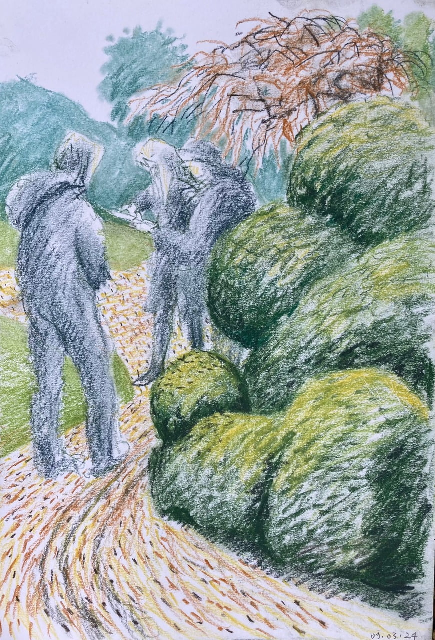
‘Getting Lost In Pretty Places’ 09/03/24-25/03/24
The date is 09/03/24. Early Spring. Some intermittent afternoon sunshine between constant rain, flooding and a miserable 9-degree dampness pervading all. Remember? I sat down on a blue bench to draw the bare winter trees. But to the right, in the corner of my eye, I clocked this little tableau, – of Denmans’ visitors getting lost in a landscape-maze and consulting their map-guide book. They paused only for a minute or two, but long enough to stamp an impression on my visual memory. So, I diverted from the bare charcoal drawing for some minutes to get this image down.
On that day too, I saw an unseasonably early Red Admiral butterfly sunning herself on the brick wall of a greenhouse. The two drawings made that day were both so different in subject, mood and intent: yet both made within an hour of each-other.
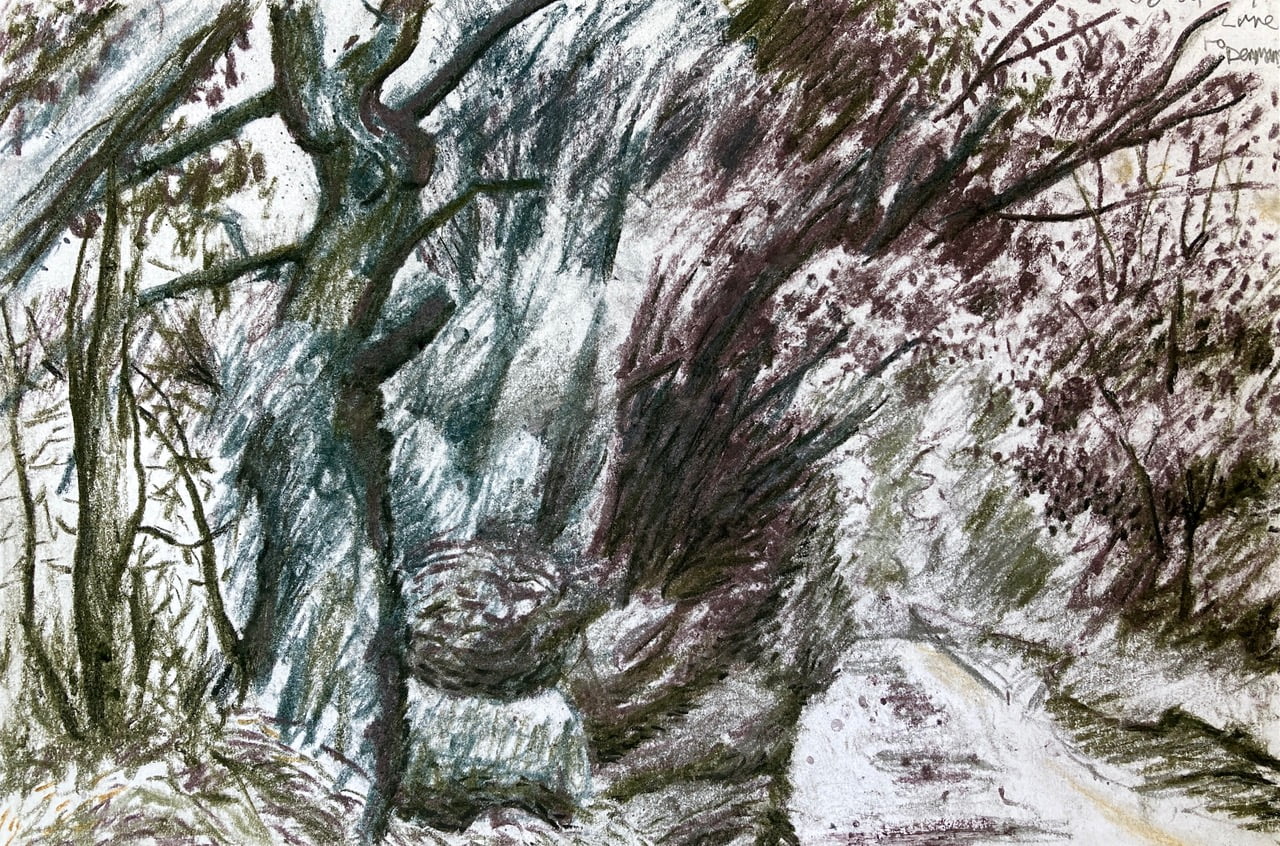
‘Through The Lane Towards Denmans’
Tinted charcoal on cartridge paper. 14cm x 21cm
Journal Entry 2b: Through The Lane 06/04/2024
Actually on the way back from Denmans after making the small pastel of their magnificent old Cherry Tree in bloom, I got it down quick in one go, before rain stopped play. I paused my cycle back to Bognor to look back through this chaotic tunnel of trees and shrubs. The adjacent woods, decimated by Ash Dieback, remain mostly bare, – with warning signs re. falling rotten branches. But the hedge itself is in full-fling-Spring-leafage, – and full of small birds. Rain interrupted me here too, making circular spots on my drawn path, as tiny raindrops exploded random charcoal grains. I exploited this accident, adding to these spots my own drawn dots to make leaf shapes silhouetted against sky.
Journal Entry 3: Fugitive Nature Meets Travelling Artist

‘Sprung-Spring’ (cherry tree in bloom). Drawn live on location in between heavy showers on April 6th.
Both of these pastel drawings involve encounters with a specific place with its own particular atmosphere or vibe – but also in a particular, transient, almost fugitive moment in Season and Time.
The glory of this April blossom on the huge, and ancient cherry tree occupies a couple of short weeks in April before being blown away by wind, saturated with rain, or dried-away by sun, making way for the next stage of luminous spring leaves.
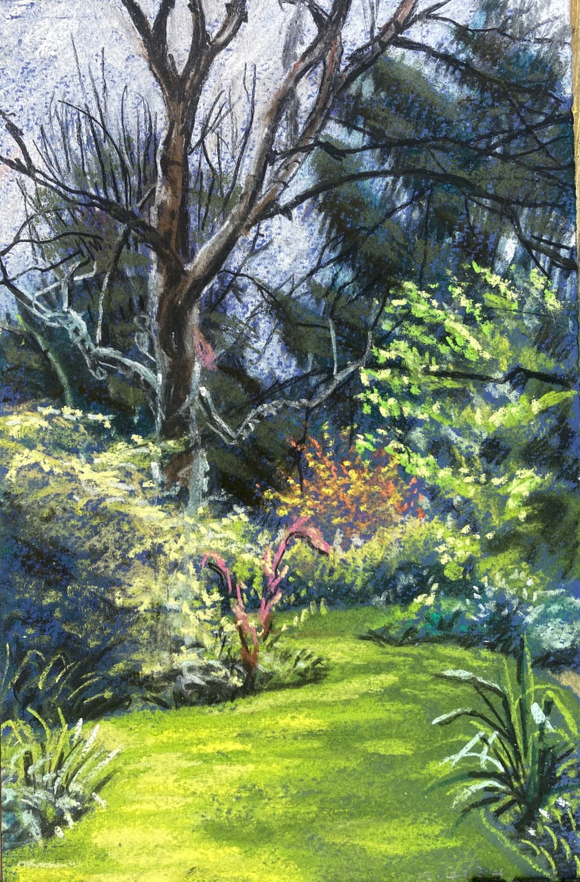
‘Enchanted Corner’ (featuring a green dry river bed garden-designed feature). Drawn live on location on Fri. April 12th, 2024. Pastel on blue Canson paper.
Journal Entry 4: Path By The Clockhouse At Denmans
My favourite time for drawing/painting/looking is late afternoon, sliding into evening. I worked on this on location on Thurs. (May 9th). Set up around 2.30pm, – and worked nonstop, in the zone until about 7.40pm. Had a stinking cold, but it seemed a pity to waste the gift of good weather.
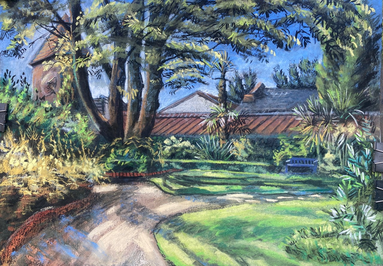
Path By The Clock House At Denmans. Final State. Pastel and charcoal on black paper. A-3 Size. (6th/final state)
A warm gold sun kept me company until about 7pm, when I took this snap. Is it a painting? Or is it a drawing? It’s dry media mark-making, as in pure drawing. Yet there are several layers of pigment, – more like a painting. I spray-fix the artwork at a half-complete stage, – with liquid fixative, which kind of transforms the drawn surface into a painted one, making the pastel wet for some seconds, and fusing it with the paper fibres with its alcohol/shellac resin which dries in seconds. And then further layers of dry chalk and charcoal are laid over the top, aligning, combining, or sometimes contradicting the colours and forms underneath. Neither quite a drawing nor a painting then. Maybe it’s a ‘drainting’?
During the first part of the afternoon, the sun is hot, and the shadows are short. I’m focussing mostly on locating my pictorial elements, building up their forms and adding some local colour. As shadows lengthen, and lights and darks get contrasty and dramatic, I focus more on capturing the feeling of that golden light and longer fugitive shadows. But it’s never quite one time of day or another. Drawing in live weather means you end up with some kind of amalgamation of whatever light and weather conditions developed and changed throughout the afternoon and evening as you draw/paint. It’s very different to drawing or painting from a photograph which captures one single moment in time, showing the exact lighting conditions and length and direction of shadow, frozen at that particular split second when the iPhone shutter flickered and recorded its image.
Journal Entry 4b- Garden Path Versus War Path 28/04/24
One thing about drawing gardens and nature so intently (inc. man’s adoring but manipulative dance with nature), – is that everything is so pretty and beautiful. There’s a wonderful struggle between chaos, order and harmony, – with focussed, aligned creativity as an aspiration of both the painter and the gardener. But another side of being an artist/creative person, is that you are emotionally aware of all the pain, suffering, violence, injustice and contradictions perpetuated in the world by ‘Man’ at it’s most powerful, and least ‘Human’. Though I am sometimes vocal about these things in words, I’ve rarely been any good at addressing these things in my visual artworks. I am even less use in addressing such problems in practice. It’s a lot to do with my conscious choice to ‘accentuate the positive, and eliminate the negative’. And yet as an artist maybe i also have a responsibility to question big wrongs? I’m just thinking aloud here, – but you are my chosen listener if you have bothered to read this so far.
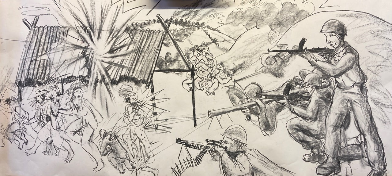
The Vietnam War ( Our 1970’s Childhood drawing reconstructed from memory and reinvented all over again in charcoal and paper in 2024.
When I was a kid at primary school, the carnage and chaos of the Vietnam War was in the news every day. My friend Yves Yarwood and I made a Bayeux Tapestry-format charcoal drawing of helmeted tommy gun wielding soldiers mowing down fleeing Asian peasants, wearing those triangular Chinese hats. We had just seen it on the 6 o’clock news. But the scene was also straight out of Goya’s ‘Disasters Of War’, – though Yves and I did not know it at the time… And so, – after lovingly rendered golden light over a beautiful, harmonious garden, – I get the feeling I need to go a draw a big battle, by way of contrast. It is also interesting that as a child I was obsessed with military history and war. I think (perplexingly) male children are instinctively drawn to this. I would do panoramic re-enactments in felt tip of the battles of Waterloo, The Crimean and The Boer War battles, right up to WW2.
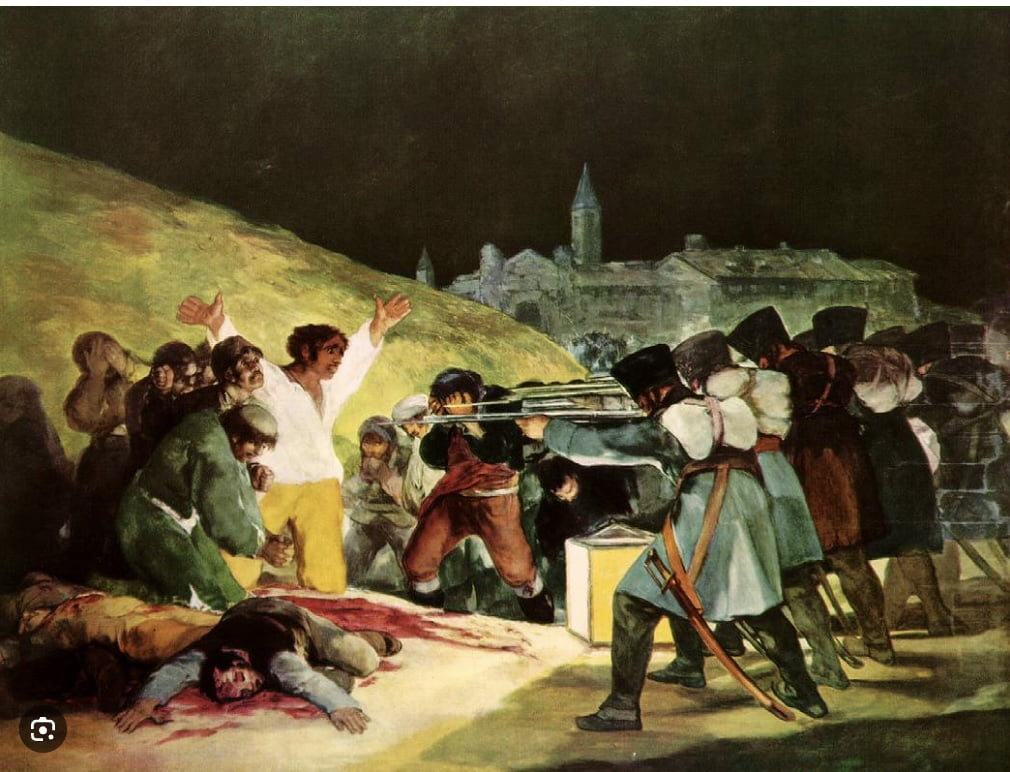
The Third Of May 1808 – Francisco Goya. Oil On Canvas.
The uniforms and arms were obsessively well observed and correct to each historical period. The drawn uniforms, ranks, arms and consequent graphic violence with oodles of red felt tip blood gave my childish brain an adrenaline rush. But parallel to this was a growing awareness that violence and war is horrific, tragic, wasteful, …and to be avoided at all costs (despite this instinctive male warrior instinct). So inside every pacifist is a warrior busting to get out. And vice versa. Nothing is ‘black and white’ eh?
Journal Entry 5: Painting Live with a sense of place whilst designing to site specific purpose
A) Making a painting to capture a vibe, 24 May 2024.
Gwendolyn van Paasschen designed the Denmans Garden feature garden (Denmans Garden: Room Outside) for the 2024 Hampton Court Garden show as a site-specific installation, reflecting a particularly loved corner of house and garden which demonstrates John Brookes’ vision of the ‘Room Outside’.
Concerned about the time constraints, we agreed that designing and painting a full-scale mural would be risky. We decided instead I should make a painting of specific size to be reproduced and placed on the installation wall, like a window-out onto the wider garden and buildings, in order to give a sense of space and, atmosphere and topography of the wider site. We agreed that a suitably enchanted place would be the winding pathway and approach to the Clock House building, – and painted to a square format.
Making A Painting to Capture A Vibe (May 24th)
I find I have to work fast with a specially thought-through, and economic working process. It needs the elegance of a Napoleon Battle strategy.
Working outside live onsite, weather, lighting and atmosphere are constantly changing. It is the interaction of these things as well as the objects, figures or topography in view, which help make the mood and sense of any given place, – whether the place is manmade, ‘natural’. or both.
To get the sense of the place I’m also constantly selecting-in, the significant elements, and selecting-out elements which I can see, but which are of less interest to me in terms of subject. In this respect, I am ‘telling a tall tale’ by being selective and focussing on certain things, while ignoring others. Every artist has to do this to a greater or lesser extent because reality is simply too complex and too inanimate to be grasped in painting. So even with more representational, less expressive work, the vision of the artist (as well as a sense of place) comes across by what he/she selects to show you, and how he chooses to show it in terms of use of materials and marks on the canvas. This is at any rate the aspiration.
When I need to work fast, I rarely begin with blank white paper or canvas. It’s like working from zero, because nothing in life or in the material world are blank or white. When working in pastel I select coloured or tonal-shaded paper. When painting in oil or acrylic I prepare by painting a light or mid-tone ground of tinted primer – often a mid-tome pale green as in this one. The first marks and drawing tend to be timid and analytical, as I work out the shape and composition of my painting and start to locate and draw-in the elements of the place which impress me most.
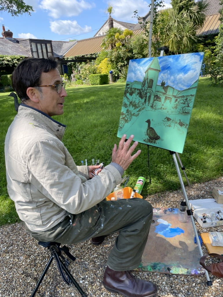
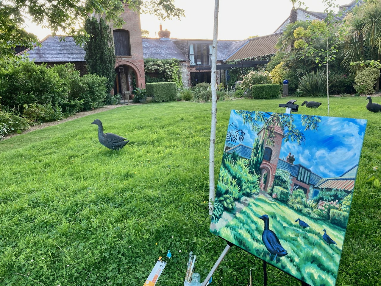
Bashing out a painting in two days.
) Bashing out a painting in 2 days.
The date is Friday May 24th. The finished painting must be made this week, so there is time to reproduce it at the correct size for the Installation. There’s nothing like a deadline to sharpen the mind. I arrive at 12-ish with a portable travel easel, a green-primed square board, a filthy big oil palette, an assortment of different brushes, with different attack functions, and a plastic biscuit tin full of gungy oil paint tubes. I have the whole of a sunny afternoon and evening to get it down – stretching through lengthening shadows. Fuelled with a flask of tea and some biscuits to be guzzled later only on a well-earned ‘half-time’ break.
This first part of the battle is quite exacting, requiring sharp observation and precision mark-making. Using a thin mix of burnt umber and black, I locate the buildings and key trees and shrubs, describing the surfaces with flat brown tones. In the past I usually did this with charcoal, but I tend to get caught up too much in the drawing process that way and end up narrowing the possibilities for lively paint use when I over-describe with drawing. So, this time I draw in paint, – not too precious… A tonal underpainting, – like underpants before trousers. Then I bashed in the sky with a mix of titanium white, and reddish blue, which could be much looser. By the time I’d set up my painting post and done all this, 2 or 3 hours had flown by. I treated myself to a BLT in Midpines Cafe instead of my tawdry rations.
C) Laying the Foundation Paint Layers
The rest of the afternoon and evening was spent mixing and applying hues akin to the dark green shadows and bright yellow sun-streaked patches on the grass-ground and showing the way the slanting sun hit the different materials of the buildings. Brick, slate and pebbledash. Defining the trees and plants I try to show not just colour, light and dark, but also shape, and the way the individual plants and trees grow. Short or long? Sharp or soft? Upwards or downwards? Bright or dull?
D) Building Up The Vision (June 2nd)
It’s now Sunday June 2nd, 8 days after my first day’s painting. The oil paint is dry and can be worked over the top with new layers. I’ve got to get it done today as Gwendolyn needs the painting for photographing tomorrow. There’s nothing like a deadline to focus energy, time and attention! I have been blessed with another perfect sunny day. I arrive at Denmans about 12.30 again and set to it hammer and tongs all day long until dusk sets in at about 8.45pm. I’m totally focussed, and 8 hours feels like 10 minutes. I treat myself again to a decent BLT lunch in the cafe as a reward – but also to save time. Dozens of ‘inbetweenie’ hues and tones are mixed to render the subtle difference in surfaces under slanting sunlight. The reddish brick pattern goes radial in shape to form the arches, and the blue-grey slate roofs are overlayed with linear tile patterns. Bolder decisions made on the almost orangey bright mustard green of grass patches which are hit and yellowed by sun, and the opposite almost blue-dark-green of the grass that is in shadow. Bright little impasto explosions of colour pinpoint the roses and tall leaning hollyhock-like plants in the background flowerbeds, which read like fireworks against shadowed house. I’m using odourless white spirit to thin and mix my paint. But the flow improves by adding a few drops of pure turpentine, which is very toxic but smells great – like Greek Retsina pine wine. Thin opaque or semi-transparent layers. Thicker impasto strokes are sparingly used. The lighter the colour and tone, the more titanium white is used. Oil tubes are highly concentrated, so the tubes of paint last for decades.
E) Fit for purpose. 
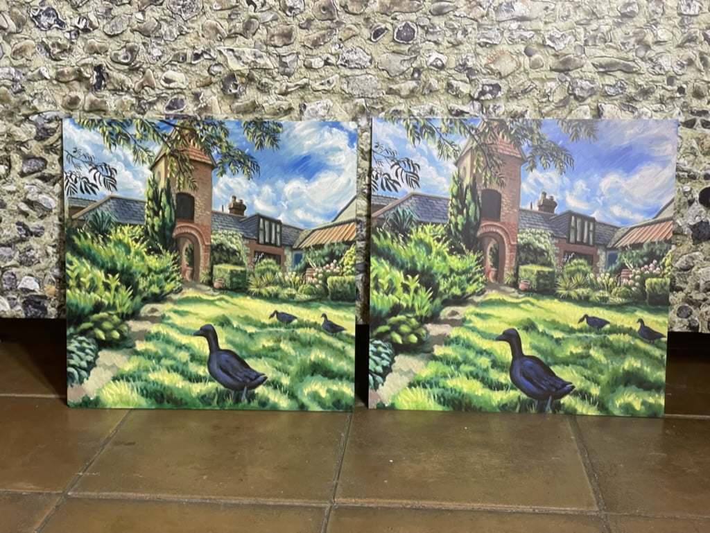
The original and the copied version ready for installation.
The painting is still not quite finished. But it is already fit for purpose in its desired site-specific function. At some later date I shall spend another day painting onsite, paying particular attention to light and dark, – probably using transparent dark glazes to build up the shadows, and by contrast, bright impasto yellows and greens to heighten the feeling of sun hitting grass, leafage and flowers.
Gwendolyn carefully photographed the painting in even-daylight (not direct sun) and the colours and tone of the resulting enlarged print are very close to the original painting.
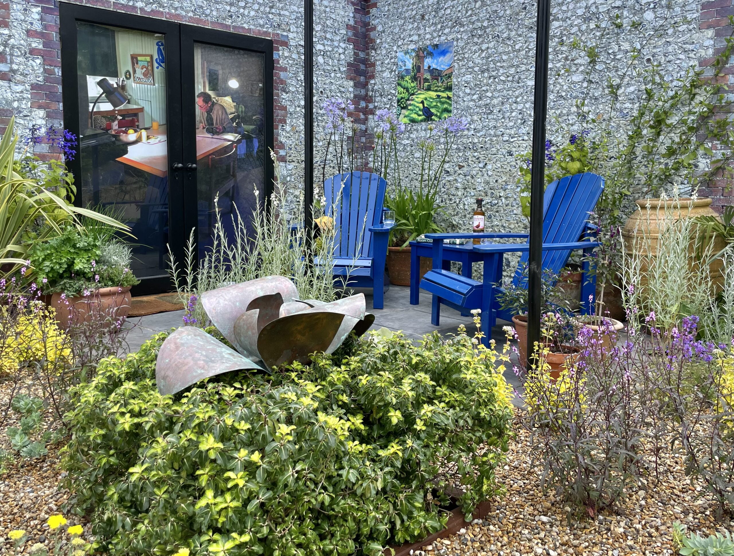
The painting in situ at the RHS Hampton Court Flower Festival.
Journal Entry 6: The Blooming Meadow Of Bloomin’ British Summertime
The main thing about British Summertime is that we are gifted with more light and longer daylight hours, so even in this electric-lit, post-digital era, we become time-rich in a very real sense, in Summer compared to Winter.
Even in Winter, I’d tend to arrive later at Denmans than I would ideally like. There are always other priorities to do with work and family matters needing attention, and I try to get these out of the way before cycling up to Denmans.
But apart from that, my creative energy seems usually to get-up steam later in the day. In Winter, I was hampered by unpredictable and inclement weather, as well as low light. Wet, miserable days with frequent showers were the norm. I economised my working methods accordingly. I worked on a smaller scale, in miniature, becoming more and more economical with choice and use of materials (A-5 size cartridge sketchbooks and Canson paper pieces torn down to A4 size or less). This meant I could swiftly form the essence of an image before the next downpour, or before my fingers got numb with cold and damp.
So, May and June have been a liberation. I am working much bigger and in a more expansive way. Having unlimited access to the gardens, after closing time, and daylight stretching well beyond 9pm, it really does not matter what time in the afternoon I arrive at Denmans, now Summer is here.
On 10/06/2024, I arrived around 2pm, and took my customary tour around the gardens. As in the Winter, so with the Summer. After mooching through the gardens and exploring its corners for just a few minutes, a subject/image seems to leap out at me from the landscape, begging to be drawn, painted or ‘drainted’. I no longer need to waste time trying to decide what to draw!
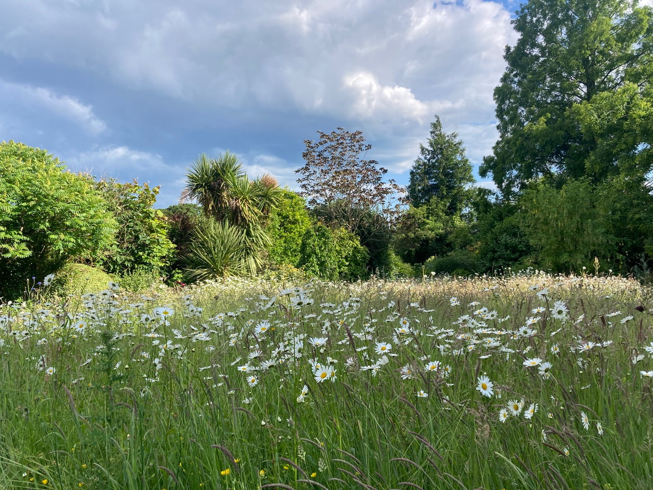
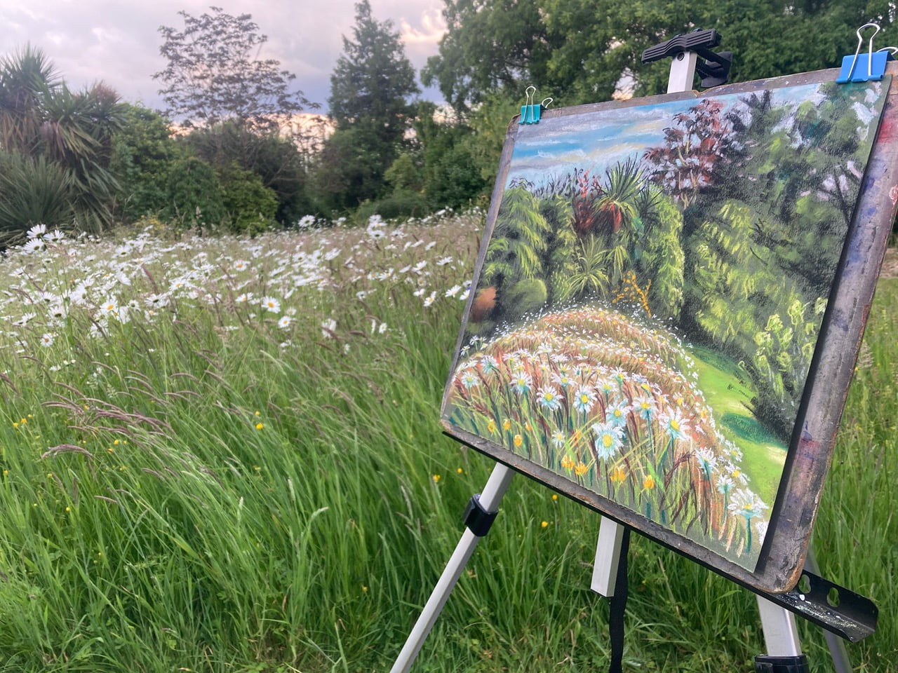
Blooming Meadow at Denmans Garden, Viewpoint Photo
And so it was on this day too, as I walked through the archway of the brick-walled garden into a green-space known to staff (as I later learnt) as ‘The Meadow’. What had registered as a ubiquitous carpet of short green grass, leading into the ‘dry riverbed’ feature back in Winter, now presented as a wild-patch-riot of long wild grass and Michaelmas daisies in flower.
I chose my viewpoint and set up my drawing/painting station (using an ingenious lightweight travel easel which packs into a zipped plastic soft-case no bigger than a music stand). Plus, a folding three-legged stall from the Pound shop. I prize such compact, convenient, packable tools for their ‘Lee-Van Cleef-style’ niftiness. Pastels, charcoals and crafty drawing tools, such as pastel spreaders and pencil-stub holders are laid out like a battle plan on a blue canvas sheet salvaged from my ‘salvage radiology’ treatment sessions of March 2023 at St Richards Hospital. Everything set up, I peeled off to catch some lunch at the cafe, before it closed, in the form of a substantial homemade sausage roll, salad and lashings of tea. The ‘Food + drink = Energy for work’ equation is a vital part of preparation, and an ingredient for any creative venture just as armies march better on a full stomach…
I chose a piece of khaki coloured Canson paper, measuring about 45cm x3 5cm. So not massive, but significantly bigger than the miniature drawings of the winter and early spring.
The first hour or so is always awkward, draining and full of doubt. My body responds by making my arm ache in fake-fatigue. But I persist and keep working as an article of faith, knowing from experience that energy, momentum and decision-making will come if I persist, whether I feel like it in this moment or not. Selecting and locating the elements and objects for my vision and arranging them spatially on the paper is always a frustrating chore. A disciple of the Slade School would dismiss my efforts as un-analytical, un-seeing, clumsy, and ultimately dishonest. In their ‘book of rules’ I cheat like hell! The creative vision sneaks in among such ‘cheating’. But my vision is of a different, more emotional nature than that of Slade Aesthetes such as Ewan Uglo. Why analyse objectively when a digital camera does that so much better? My type of seeing is subjective yes, but equally exacting and incisive in its imprecision. For being in-precise and un-objective, it is no less acutely observed and no less particular.
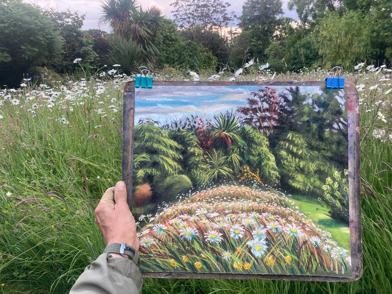
‘Blooming Meadow’ Site-specific shot with work in Progress
So, the first hour of work feels like five hours…But the following 4 hours feels like only five minutes as the momentum and application takes hold. Time shifts into a faster gear completely! A musician friend of mine talks of this altered state as ‘Jazz Time’. And its transferrable across all fields of creativity activity and every kind of malleable media.
After locating my elements on the paper, I quickly lay down the first layers of pastel. The brightest field of my vision is (as usual) the sky. The row of shrubs and trees meeting the horizon is by contrast extremely dark, yet not a silhouette. The tonal range of the real, seen world is incredible! It is impossible to match the brightness of the real sky in any artwork or photograph, no matter how objective or subjective they may be. But we can echo this delightful brightness and tonal contrast by working process and choice of materials. A layer of pure white chalk right across the sky, before working some pale blues across the top, leaving the tree line as untouched dark khaki colour paper, but with dark browns and blacks in the shadows, and pale green strokes where the sun hits foliage. The second brightest thing is the foreground grass meadow, where the white explosions of Michaelmas daisies are as bright as the brightest parts of the sky. But for now, I put a layer of luminous pale green across the whole meadow space. Then I fix this ‘under-drawing’ and take a break…a flask of hot mint tea and biscuits, – prepared earlier, – ‘Blue Peter style’.
The remaining hours of work consist of further pastel layers applied selectively on the top. Paper easily becomes saturated with chalk pastel, after which further layers won’t stick, – unless you fix…On an even and thorough spraying, the wet pastel drops down, and almost seems to disappear in places; and then it miraculously reappears like a rising phoenix, as it dries. After fixing the contrast and drama of an image get bumped up, but you tend to lose subtle half tones and paler colour-hues become more transparent. The surface itself is renewed in that it is now easy to apply further pastel layers over the top. In the winter I cut corners by using un-perfumed, firm hold hairspray to fix. But now, with longer summer hours, I’m using artist’s fixative in bottled, liquid form (made from shellac and alcohol). It is applied by air blown through the mouth down a metal tubular liquid spray diffuser. This changes colour and tone much less than the hairspray (is the perceived wisdom). It’s not so easy to really assess the difference by eye. But the liquid fixative is much more efficient, requiring only one or two sprays across the page, whereas the aerosol hairspray will require 5 or 6 sprayings to get the same level of fix.
Blooming Meadow’ End-state at close of day. Pastel on dark khaki Canson paper. 45cm x 35cm.
The rest of the day was just a blur, – a struggle to achieve this extraordinary range of tone and colour hue. There were just two interruptions, first from a phone call I had to take (usually the phone is turned off or ignored when I work: It’s the only way to maintain focus). The second interruption was entirely natural, in the form of threatening grey cloud incoming, and warning flecks of rain. At one point this looked serious enough that I had to remove the paper and board from the easel and stick it upside-down underneath the neighbouring blue bench and covered the laid-out pastel sticks with my rain cagoule. Rain and wetness are the worst enemy to works on paper, especially pastel, which will run if caught in a rain storm. Luckily the black cloud was an idle threat and the rain moved off to somewhere else.
By the time I was packing away, the light was fading, and it was already 9pm. A heavy dew had quite suddenly formed at ground level soaking the bottoms of the pastel boxes completely, though the pastel sticks themselves were unharmed, – as was the artwork. Looking at the photos of the drawing now, (which I packed away after a final fix and taking photos) – Its clear to me that this drawing isn’t quite finished. The trees and bushes meeting the horizon are not dark enough compared to the sky and foreground field…Some careful post-production work in the studio is required to bring back this contrast, being also careful not to destroy the life and energy of the marks with tentative revision. Finishing an artwork is a balancing act, far more hesitant than the previous stages. All too often I have ruined works with the best of intentions. But it’s worth taking the risk if the artwork isn’t quite aligned to the vision and isn’t really expressing what you saw and felt at the get-go.
Oscar will be exhibiting his Denmans Garden Residency work in the early New Year but in the meantime we have a ‘Prelude’ exhibition in Midpines Café main dining pavilion with some of Oscar’s previous work done primarily in Sussex. This is a free exhibition open over the summer from 10am-4pm daily.
For more information on Oscar go to https://www.oscarromp.co.uk/
@oscarromp